Inside a Renovated Midcentury Gem in Lincoln
A 1950s Massachusetts home receives a contemporary update that connects to its spectacular surroundings.
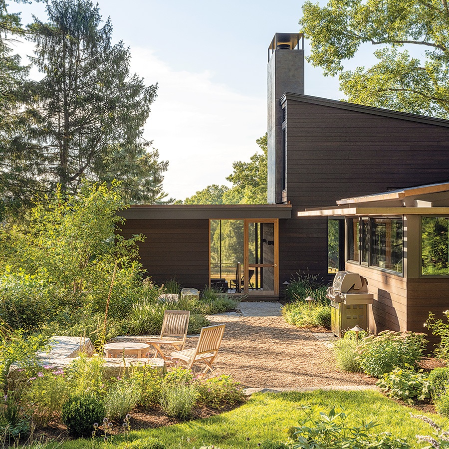
Photo by Trent Bell
With a wooded landscape featuring sunset views and vast open green space that extends toward Fairhaven Bay, the goal for the renovation of this midcentury-modern home in Lincoln was to create interior spaces that take advantage of the setting. With an expanded kitchen showcasing water views, a new screened porch, and a restored rotunda in the foyer, the property’s bucolic surroundings are now seamlessly integrated into the abode.
“The original building was built in the 1950s. There had probably been five subsequent additions and no reference to the original design,” architect Tom Murdough notes. “It was sort of an incoherent group of volumes.” The team needed to edit and clarify the structure to accommodate additional living space that the homeowners wanted as a family of five. This included adding 933 square feet to the screened porch. In addition, the clients also love entertaining outdoors, and because they really wanted to connect physically to their meadow space in the back, adds Jenny Tjia, senior associate at Murdough Designs, syncing the home to the landscape was paramount.
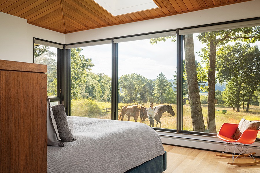
Photo by Trent Bell
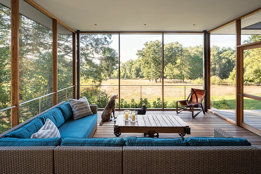
Photo by Trent Bell
Make the Most of What You’ve Got
“Design isn’t always what you bring to the property,” says landscape architect Todd Richardson. “Sometimes it’s what you do on a property to reveal and celebrate the very things that are already there.” That was the case with this project, where Richardson worked on changes to the home’s entrance and other access points in and out of the house (like the screen porch and deck). The extent of these transitional spaces, he adds, provides a nice segue into the landscape in key locations. “The way that the house opened up and provided opportunities to make those connections was terrific; the interior spaces, in my view, live larger now,” Richardson continues. “[For example] if you go into the kitchen and dining room area and see how it relates to the outdoor cooking and entertaining space, it just naturally flows outward, making things feel bigger. I think that doors are swung open a lot more, and the family migrates out of the house in ways they didn’t before.”

Photo by Trent Bell
Reworking the Rotunda
“[The homeowner] really didn’t like the existing rotunda, which was the result of all these very dissimilar additions and renovations, and the couple laughed about it because one of their big questions was: Can we do anything to make this not look like a Hobbit house?” Murdough explains. “So, one of our strategies was to incorporate a horizontal datum, which you see in the back but also in the entry sequence, that tries to unify it.” The rotunda was very out of sorts with the home’s original modernist language. “It’s something we probably would have loved to eliminate, but there was a budget and constraints,” the architect adds. “The question was: How do we incorporate it? We cleaned up the rooflines, and on the entry-court side, we simplified the space to emphasize this idea of a semi-court, which was complemented by Richardson’s work [that includes a garden around that area].”
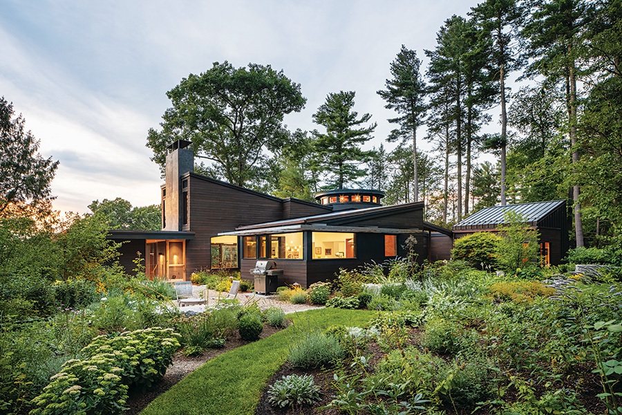
Photo by Trent Bell
Side Effects
“The side patio off the expanded kitchen and dining area was a perfect location for the grill and for drinks since the family loves to entertain,” Tjia says. “At the same time, the location is a southern exposure. We added a new screened porch so that there’s direct access to the meadow.” Previously, this enclosed space was used as a gym, but it was a little nondescript and didn’t allow passage through. “You’d have to walk all the way around the house to get to the outside. This way, you’re able to pass through the screened porch, which they told us is their favorite space—especially during COVID— for all their kids,” she adds. “It affords this great view of the meadow but also gives them protection from mosquitos.” In addition, the integration of a long overhang provides shade and shields the family from the glare of sunlight.
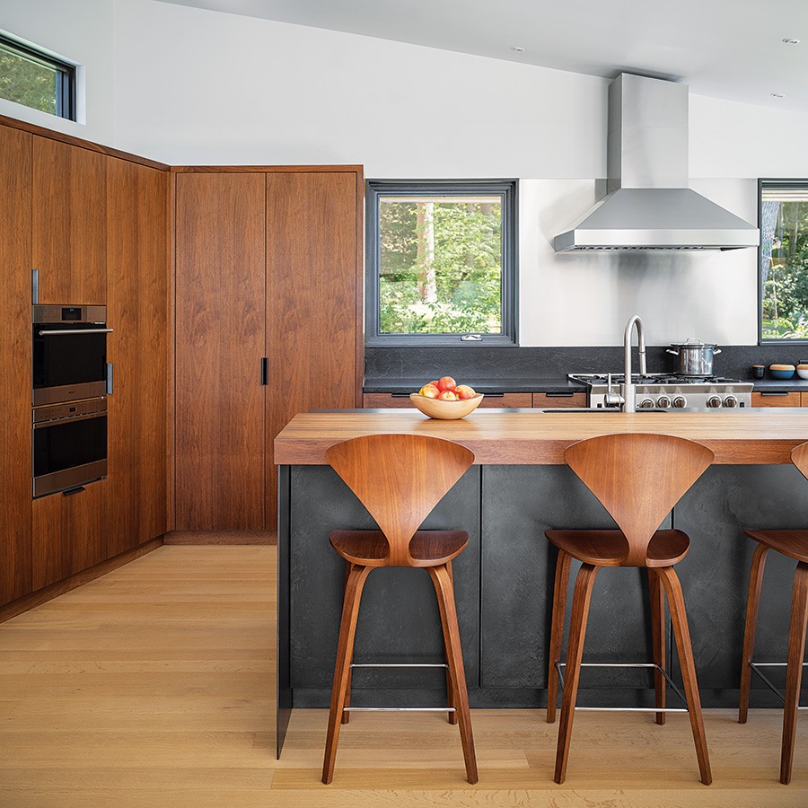
Photo by Trent Bell
Made to Measure
For the kitchen and family room, builder Kevin Cradock and his team—which included project manager Zach Southwick—were focused on turning the design bones of the home into something more current and cohesive. “Nothing’s off the shelf here; every part is custom-made for the house from beginning to end,” he says. Materials used in both spaces include walnut and black steel, and exceptional millwork is seen throughout; a bench that separates the two rooms serves as one example. With a connection to the outdoors being a running theme, the granite hearth featured in the living room is the same material used outside on the steps and walls. In addition, the black windows from manufacturer Lepage were designed to bring the exteriors inward since, as Cradock notes, “this was one of those jobs that’s as much about the landscape as it is the house.”

Photo by Trent Bell
Architect Murdough Design Architects
Builder Kevin Cradock Builders
Landscape Architect Richardson & Associates
First published in the print edition of Boston Home’s Summer 2024 issue with the headline “Outdoor Integration.”
