Inside the Tranquil Parisian Elegance of South Boston Restaurant Petula’s
This Southie spot evokes the styling of a European café with an original blend of Old World charm and modern elegance.

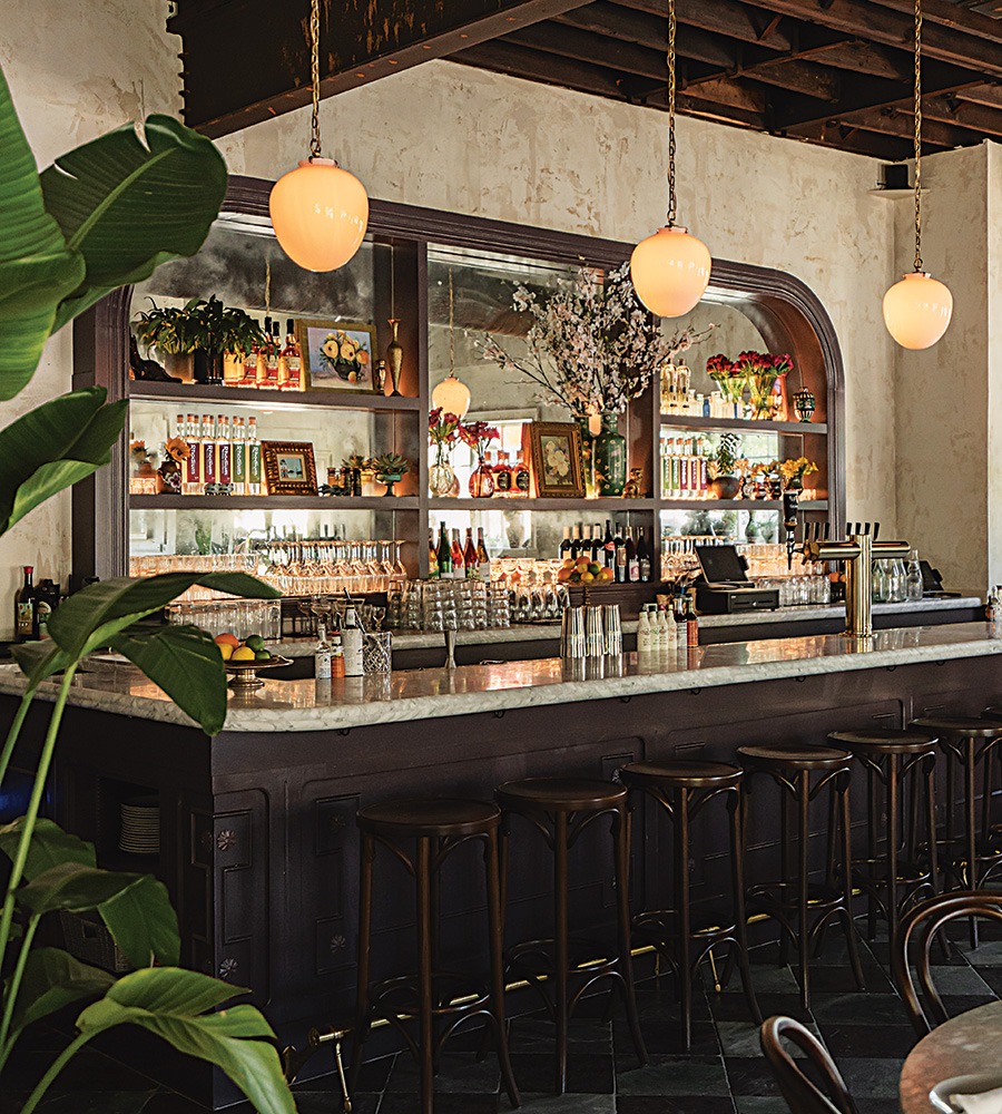
Petula’s owner, Rachel Titcomb, chose a deep-purple paint for the bar. “It was a bold move,” she says. But the result became one of her favorite details in he restaurant. / Courtesy photo
When Rachel Titcomb first saw the South Boston space that would become her debut restaurant, Petula’s, she knew it needed to be brightened up. The vacant corner building on L Street was dark and dated, but Titcomb’s vision for her restaurant was something drastically different: a traditional French-café vibe that was airy and open and struck a balance between elegance and comfort, Titcomb says. “I wanted something cozy and inviting but with a lot of character.”
To execute that vision, Titcomb enlisted her longtime friend Samantha Pratt of design firm Pratt & Deutsch Interiors. The first major item on the agenda? Ripping out the space’s low ceilings and exposing the wood beams underneath. That alone added an extra 4-plus feet of height to the dining room, which made the space feel much more open. As for the aesthetic to fill it, the goal was “Old World charm” with modern elements, Titcomb says. To achieve a textured, aged appeal in the dining room, wainscoting was installed, and walls were painted with multiple coats of limewash from Portola Paints. Then they outfitted the space with a mix of Carrera marble and wood-topped iron bistro tables and a long banquette for diners to enjoy Petula’s eclectic and locally sourced menu.

An antique-glass mirror hangs on the limewashed walls in the dining room. / Courtesy photo
The true gem of Petula’s, though, is the showstopping bar. Delineated from the main dining area with marbled checkerboard tiles, the mirrored, arched back bar is coated in a bold, deep-purple paint, as is the Carrera-marble-topped bar. “It’s the most impactful part of the space,” Titcomb says. “And one of my favorite components of the restaurant.”
Beyond the larger design elements, Petula’s shines in the details—specifically the antiques sourced by Titcomb and Pratt. From the Harvard lecture podium repurposed as the host stand to the antique glass behind the bar and the knickknacks sprinkled among the liquor bottles, each piece is intended to make the newly renovated space feel aged like a fine French wine. “The goal of all those elements was to add authenticity to the space and make it feel like it’s been there forever,” Titcomb says. Add in the light streaming through the windows and the abundance of green plants throughout, and Petula’s fits Titcomb’s vision perfectly.
First published in the print edition of Boston Home’s Summer 2024 issue with the headline “French Connection.”


