Designer Alex Crecelius Embraces Bold Black Interiors
A designer and homeowner bond over the color black amid rattan, fringe, and fur.
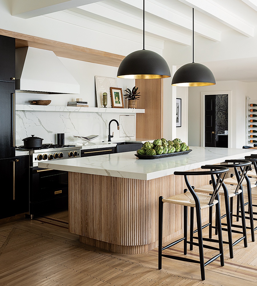
Black-metal dome pendants with gold-foil interiors take cues from the black BlueStar appliances with brass accents and give off a gorgeous glow at night. / Photo by Tamara Flanagan
The first thing Stephanie DiPrete said to designer Alex Crecelius was that she wanted the exterior of her yet-to-be-identified new home to be black. “She said, ‘Yes! We’re going to be perfect together!’” DiPrete shares. Black is one of Crecelius’s favorite colors. “Black makes a statement,” the Alex Interiors founder says. “Using it in your home means that you know who you are, and you’re not afraid to show it.”
The weathered cedar shingles of the 1880s Victorian that DiPrete purchased in Providence are now a sooty charcoal. Once, a woman walking by told DiPrete she was sorry that her house had turned black. Most people, however, say it’s amazing, DiPrete reports. The doors and window frames with original leaded glass are painted a glossy black, as is the interior stair with original barley-twist newel posts and balusters.

In the evening, DiPrete sits on the porch with a glass of wine at her Providence home, chatting with neighbors who wander past. Crecelius describes the home as a Victorian bungalow, likening it to casual Victorians in San Francisco. / Photo by Tamara Flanagan
Black accents run throughout the home, yet the effect is more Scandinavian-meets-rock-’n’-roll-meets-hippie-chick than slick. “There is a lot of contrast, but the rooms feel cozy,” the designer says. “Curved silhouettes that reference the arched front porch and organic materials that speak to Stephanie’s bohemian side soften the edge.”
Crecelius opened up the floor plan—it suffered from a railroad-style layout—allowing sunlight to suffuse the space. The walls, trim, and ceilings are a clean, bright white. Playing off DiPrete’s love of Nordic design (the homeowner has been to Copenhagen five times), Crecelius refinished the home’s original, skinny oak floorboards to look almost raw. Then, she layered in furnishings with simple lines and plenty of texture.

Rattan, leather, sheep-skin, and alpaca come together to create a Scandinavian-meetsboho aesthetic in the living room, where a vintage waterfall console plays off the channeled sectional. “We wanted the spaces to feel soft, even though they’re very black and white,” Crecelius says. / Photo by Tamara Flanagan
A scrumptious sheepskin rug defines the living space, accentuating the Scandi style and lending the tactile coziness so important to DiPrete. A low-slung sectional is where DiPrete hangs out with her three 20-something daughters, who return home often, and where friends gather for football games. Leather sling chairs that Crecelius found (along with the 1970s waterfall console table) at the Brimfield Antique Flea Market live in the sunny windowed corner but are easily pulled up to the ensemble.
DiPrete and her daughters are enthusiastic cooks, and DiPrete is a frequent host, making a standout kitchen a must. An island with a rounded, reeded base is the centerpiece, and black appliances, black cabinetry, and a black stone sink nestle inside a niche outlined in oak. “The salesperson at the showroom said they had never had clients cool enough to do all black appliances,” the designer shares.
Opposite the island, French doors replaced a window to facilitate entertaining al fresco on the bluestone patio. “Before, I had to go down the winding basement stair to get to the patio, which wasn’t easy to maneuver with a tray of drinks,” DiPrete says. As for the tall, leaded-glass window, the team moved it to the dining room to bring light into the back of the home.

Crecelius transformed the basement mudroom with black paint, a wall-to-wall jute runner, a woven bench, and rattan hooks. “We didn’t spend a lot, but the result is cool; it’s definitely not an afterthought,” she says. / Photo by Tamara Flanagan
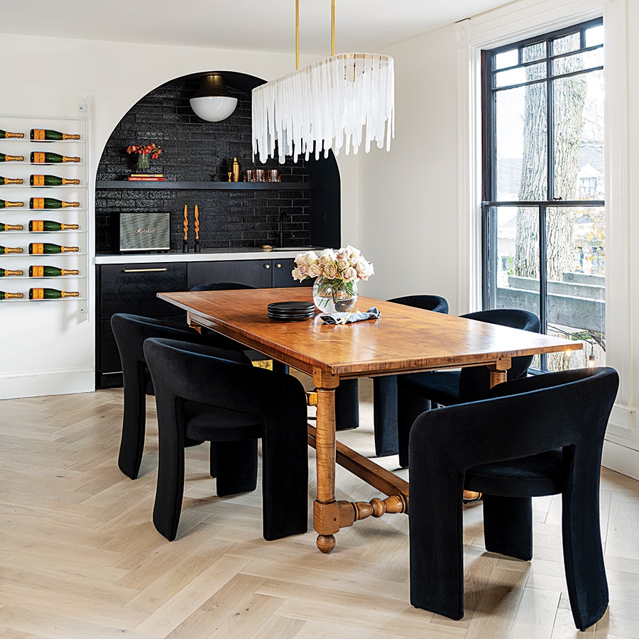
Crecelius had a gunmetal wine rack by Four Hands painted white so that it would not compete with the bar. “It melds with the wall, so the bottles appear to float,” the designer says. As for the dramatic bar, homeowner DiPrete says, “People go gaga over it.” / Photo by Tamara Flanagan
The most dramatic moment is the arched, black-tiled niche wet bar in the dining room. The bold gesture is not just an eye-catching backdrop for DiPrete’s tiger-maple table, now surrounded with sexy black-velvet chairs; it pulls the eye—and the guests—through the space. “The glazed brick tile looks like it could have been there from the beginning, painted black at some point by previous homeowners,” Crecelius says.
Upstairs, Crecelius amplified color and texture in the primary bedroom with a grasscloth wallcovering, a black ceiling, a sumptuous flokati rug, and thick, fringe-y window shades. “The directive was sexy, cozy, and chic, like a boutique hotel,” the designer says. In DiPrete’s twin daughters’ bedroom, a tie-dye wallcovering and shaggy rattan baskets turned into pendant lights lend a vacation vibe, while her younger daughter’s bedroom and the hall bath find punch from iconic black-and-white Schumacher patterns. “My kids love it here,” DiPrete says. “And so do I.”
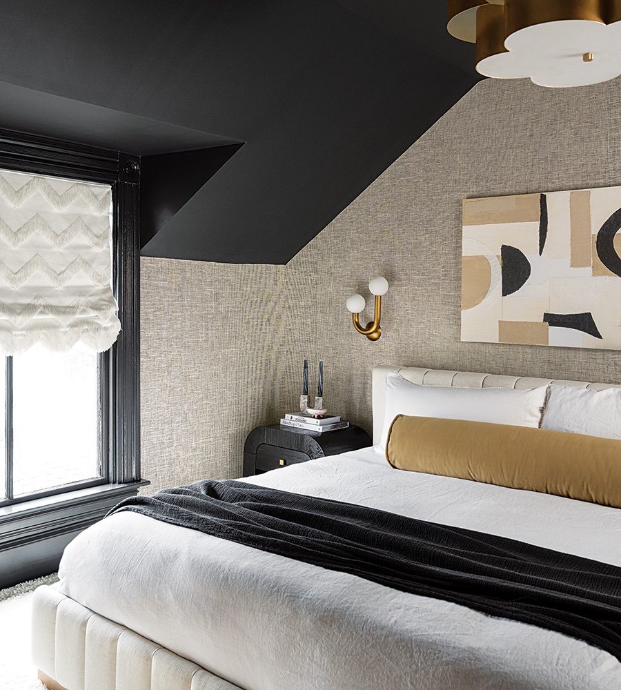
DiPrete adores the custom flokati rug from the Carpet Workroom in her bedroom, which is paired with a Winfield Thybony Design grasscloth wallpaper with black backing. The curves of the Visual Comfort & Co. ceiling light, Regina Andrew sconces, and Tov nightstands counterbalance the sharp angles of the ceiling. / Photo by Tamara Flanagan
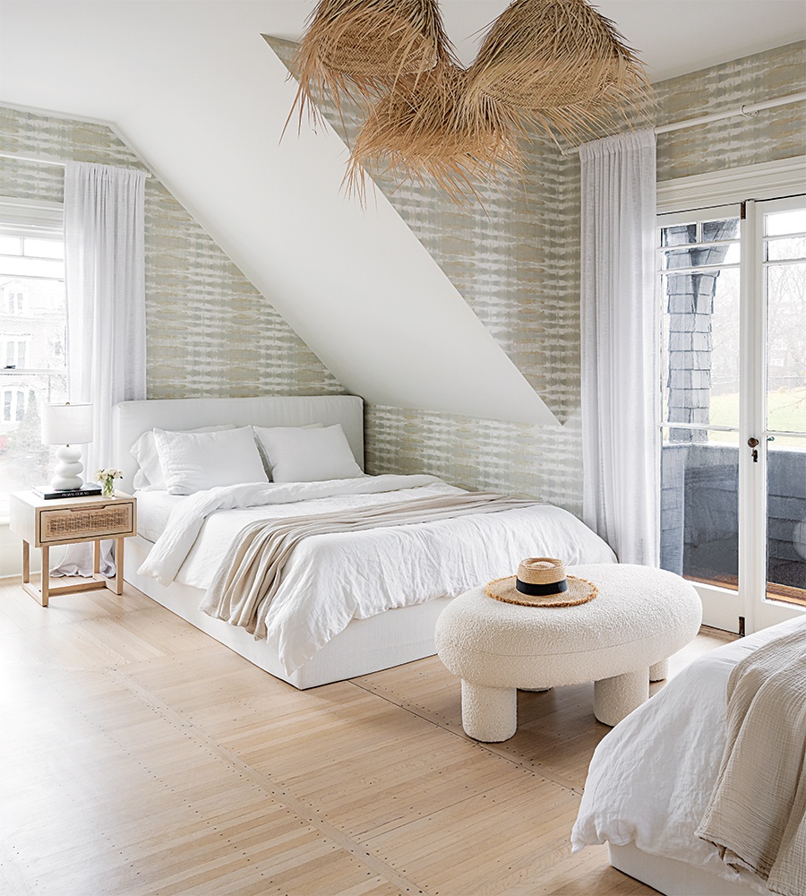
To up the vacation vibe in DiPrete’s twin daughters’ bedroom, Crecelius hung a cluster of baskets that she had made into oversize pendant lights. A grasscloth wallcovering by Anna French wraps the space, and original French doors lead onto the second-story porch. / Photo by Tamara Flanagan
/ Photo by Tamara Flanagan
The Heart of the Home
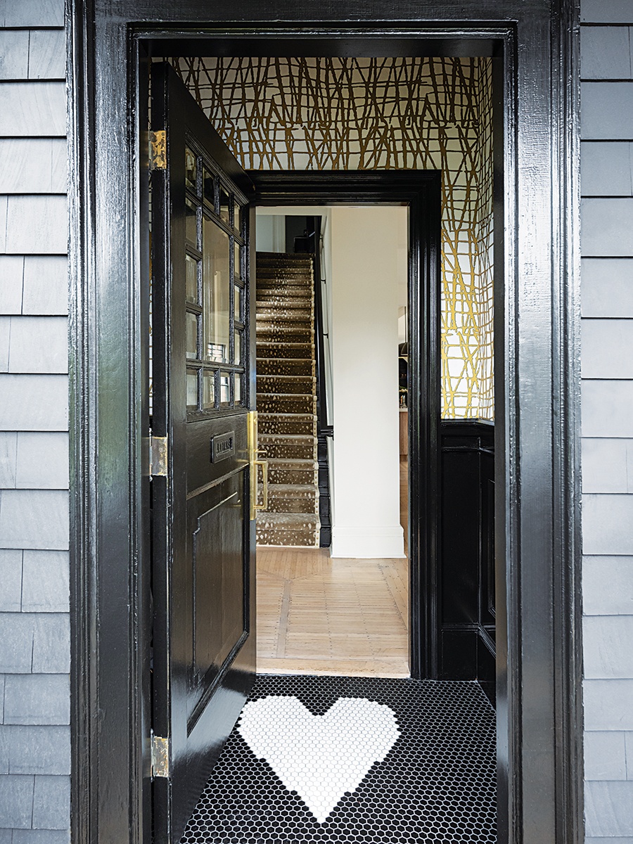
When DiPrete’s daughters vetoed her idea to tile an apparently corny greeting in the vestibule, Crecelius suggested this: a tall and pointy rock ’n’ roll–style heart. Her inspiration: Pieces by jewelry designer Stephanie Gottlieb. Crecelius fashioned the feature herself, using a box cutter to get just the right shape out of 1-inch hexagonal tiles on a 12-by-12-inch mosaic sheet.
Contractor J2 Construct
Interior Designer Alex Interiors
First published in the print edition of Boston Home’s Fall 2024 issue, with the headline, “On the Dark Side.”

