Exploring the Latest Furniture Trends at Milan’s Salone del Mobile
David Hacin and members of his architecture and design firm ventured to Milan, Italy, for Salone del Mobile this spring. Here’s what they found.
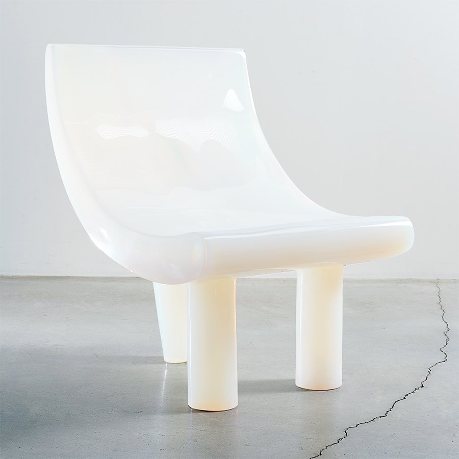
Objects of Common Interest for Nilufar Gallery, “Klisis” chair. / Photo by Ambra Crociani
This article is from the fall 2024 issue of Boston Home. Sign up here to receive a subscription.
The event of the year for the international design world is the Salone del Mobile furniture fair, held during Milan Design Week. Now in its sixth decade, the fair sets trends in the interior design industry and showcases advancements and innovations in product design. Architects, designers, craftsmen, manufacturers, editors, and design aficionados travel from all over the world to see the exhibition; for networking, it’s a must-attend and a heck of a good time. This year, David Hacin, who helms architecture and interior design firm Hacin and who’s been lucky to attend Salone numerous times, brought his team to the fair.

Courtesy photo
David Hacin: Today, only a few years after the catastrophic impacts of COVID restrictions, it’s fair to say that Milan Design Week now encompasses so much more than the introduction of new furniture (although that alone is very exciting). Interior and product design are now celebrated, along with art, fashion, industrial design, and extraordinary installations of sound, light, and music, all set against the backdrop of the city’s historic and bold new architecture. I brought an interdisciplinary team to Salone to best leverage our time and skills, learn as much as possible about what is happening on the global design stage, and think about how we might translate some of that innovation for our audiences in Boston, New England, and the U.S. more broadly.

Courtesy photo
Jennifer Clapp, Principal, Interiors: An exploration of handicraft is evident in everything everywhere, all at once. What is driving our need to see exposed joinery, handcrafted details, natural materials, and earthy palettes? Why are people flocking to the Hudson Valley to attend an arts-and-crafts fair while sporting plaid flannel? And what is up with the modern farmhouse? It seems many people are craving comfort right now, and with that comes the need to surround ourselves with spaces and objects that exude softness, humility, and imperfection. We need a giant hug. I was on a scouting mission to see if Europe was catching on, and it seems that they are—big time.
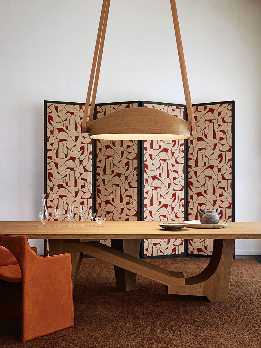
Christophe Delcourt’s “Horses in My Dreams” collection, featuring ORS light, UGO table, and CLE chair. Available at Minotti Boston. / Photo by Francis Amiand
Christophe Delcourt had one of the best new collections. It was full of elegant gestures, hardy materials, and a unique point of view that set it far apart from any current trends, rendering it timeless.
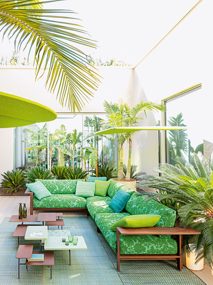
Outdoor sectional from Paola Lenti’s collection. Available at Casa Design. / Photo by Sergio Chimentithe
Paola Lenti continued exploring recycled materials, creative color combinations, and new materiality with enameled tiles, ceramics, and cast-glass pieces. We saw many product designers mixing materials for a more collected, elemental feel. Porada expanded on their existing collection with more pieces celebrating soft, silhouetted wood and echoes of ’70s lounge living.
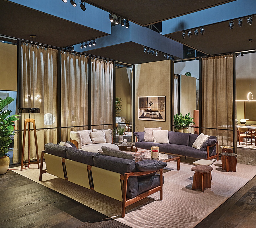
Seating and accent tables from Porada’s “Twenty Four” collection. Available at Casa Design. / Courtesy photo

Courtesy photo
Christine Rankin, Senior Associate, Multidisciplinary Design: As an interdisciplinary designer, it is refreshing and inspiring to be immersed in the design culture of Milan, which inherently blurs the lines between architecture, interior, graphic, and product design. The theme of the show this year was “Materia Natura,” which invited designers to explore the interplay between matter and nature. As a result, we saw an abundance of innovative approaches to sustainability, a resurgence of handmade finishing and manufacturing techniques, and unique combinations of synthetic and natural materials.
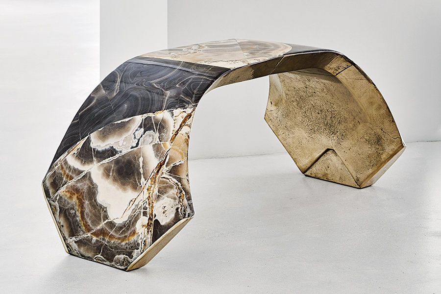
A sculptural console by Vincenzo de Cotiis. Available at Minotti Boston. / Photo by Wichmann + Bendtsen Photography
At the show, my exploration of materiality was inspired by work such as the incredible Objects of Common Interest collection made from powdered opal and resin—reminiscent of the iridescence of 17th- and 18th-century opaline glass made using calcinated bones! In addition, a series of objects, furniture, and lighting from Vincenzo de Cotiis combined black onyx and handpainted recycled fiberglass to result in a brilliant dichotomy—both ancient and futuristic, massive and ethereal, luxurious and industrial.

Courtesy photo
Eduardo Serrate, Senior Associate, Architect: Thinking of design interchangeably as architecture, interiors, product, fashion, et cetera, is a mental flexibility that is very culturally Milanese. Whether it is a building, a chair, or a fabric, they bring a common sensibility to them—a playfulness, even—that is pretty evident, and their designs benefit from borrowing from the toolkits of one another. As an architect in the U.S., where the disciplines tend to be more siloed, there’s plenty of inspiration in this approach. At this year’s Milan Design Week, I saw two strong recurring themes—layering (be it materials, planes, or textures) and softness (a recurring post-pandemic trait)—deployed in different ways but easily recognizable everywhere.
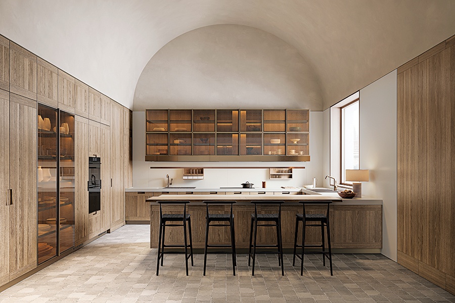
Arclinea’s “Principia” line. Available at B&B Italia. / Courtesy photo
With the show’s focus on kitchen and bath this year, I was impressed by Arclinea’s Principia line, which combines sleek metal cabinets with grooved oak doors, layering modern and traditional. A kitchen island from the Cut layers a beautiful round table over the counter that pivots out effortlessly to create a dining surface with a built-in turntable. The gesture is equally dramatic as it is purposeful, particularly in urban homes. In the same vein, we saw the beautiful Eclipse faucet by Fantini that pivots off-center, offering an unexpected twist on a common gesture that is satisfying and engaging.
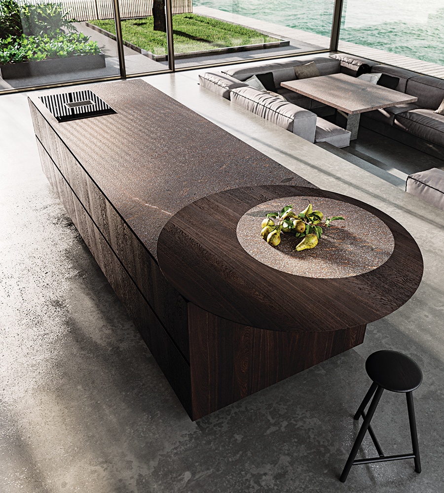
A kitchen island from the Cut’s “Eterea” line. Available at Divine Design Center. / Courtesy photo
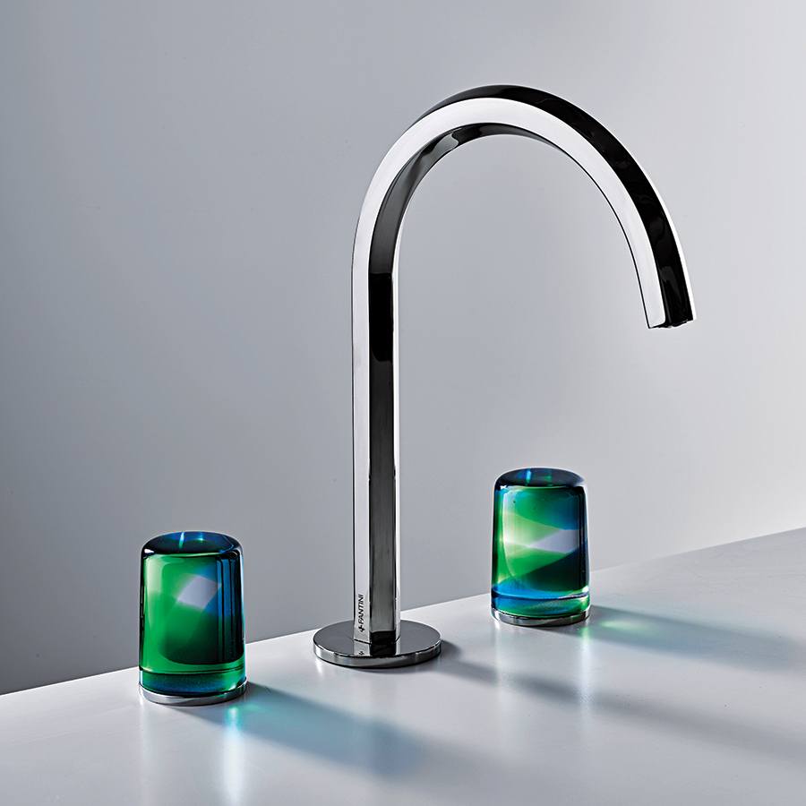
Two-tone Murano glasshandles from Fantini’s “Venezia by Venni” line. / Photo by Sara Magni
First published in the print edition of Boston Home’s Fall 2024 issue, with the headline “Italian Immersion.”

