A West Roxbury Interior Designer’s Toughest Client? Herself.
How design pro Rachel Reider transformed her own Georgian Revival home into a jewel-toned sanctuary—without firing herself.

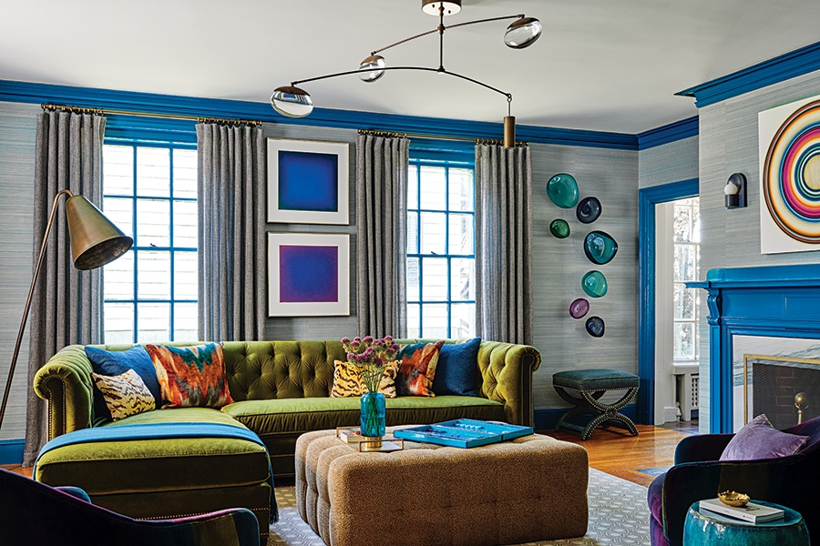
Working with brilliant jewel tones, Reider painted trim work in Benjamin Moore’s “Pacific Ocean Blue” and added a deepgreen Lee Industries sectional. Wall pastels by George Chaplin from Cynthia Byrnes Gallery add extra depth and color. / Photo by Read McKendree
This article is from the winter 2025 issue of Boston Home. Sign up here to receive a subscription.
When it finally came time to renovate her own home after living in it for several years, interior designer Rachel Reider joked she should hire a friend. Having run her own design firm, Reider + Co, for nearly 20 years, she’s seen thousands, maybe millions, of upholstery swatches and paint samples, which she plays with on the studio floor like puzzle pieces until the winning combination comes together. But when the focus shifted from client work to the 1912 Georgian Revival in West Roxbury she shares with her husband and two daughters, all she craved was someone to simply narrow it down and say, “Here’s choice A or choice B—pick one!” Finalizing those little details became the true joy—and pain—of her project. “I’m my own worst client,” she laughs. “We’re just exposed to so much!”
Reider knew she wanted to spring for lots of color and make the interiors as layered as possible. “I love color and knew it’d never be a neutral house,” she says. “I’m naturally drawn to jewel tones, so I wanted a cohesive palette that worked its way through the home.”

Patterns pile up playfully in the primary bathroom, where an Aronson Woodworks vanity is paired with wallcoverings by Innovations and blue tilework from Discover Tile and Artistic Tile. / Photo by Read McKendree

The den, a former playroom, is now the beloved library outfitted with a custom bookcase made by Smith & Awudo and adorned with Arteriors sconces and a Four Hands lounge chair to sink into. / Photo by Read McKendree
Color bursts inside the little den, which represents the flexibility in layout for the family. This space, set off a three-season porch, morphed from a playroom to an art room to the library as the girls, now 11 and 14, grew. It’s become Reider’s favorite room in the house, full of color-blocked shelves chock-full of titles she’s read.
She went bolder in the living room with saturated blues, her favorite hue, creating a lively gathering spot. Here, deep-teal paint is splashed on the trim and fireplace surround, while pale-blue silk wallcoverings and a green sofa feel sultry and luxurious. The whimsical Ochre pendant—a longtime item on her wish list—hangs overhead while the walls are graced with alluring pastels. “I grew up around art, being dragged to galleries and openings by my parents, so it informs and inspires my design and is really why I went into this business.”

Art and architecture meld with a custom bench by Lusso Design in Mokum fabric and 3-D wood-veneer art by Elisa Strozyk, which hangs over the fireplace. / Photo by Read McKendree

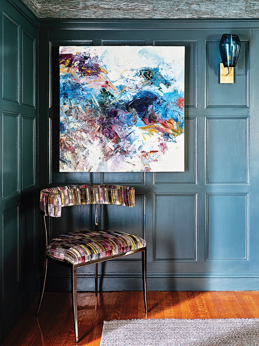
In the dining room, Benjamin Moore’s “Stonecutter” makes for a moody gray-greenblue that’s even more atmospheric after dark. / Photo by Read McKendree

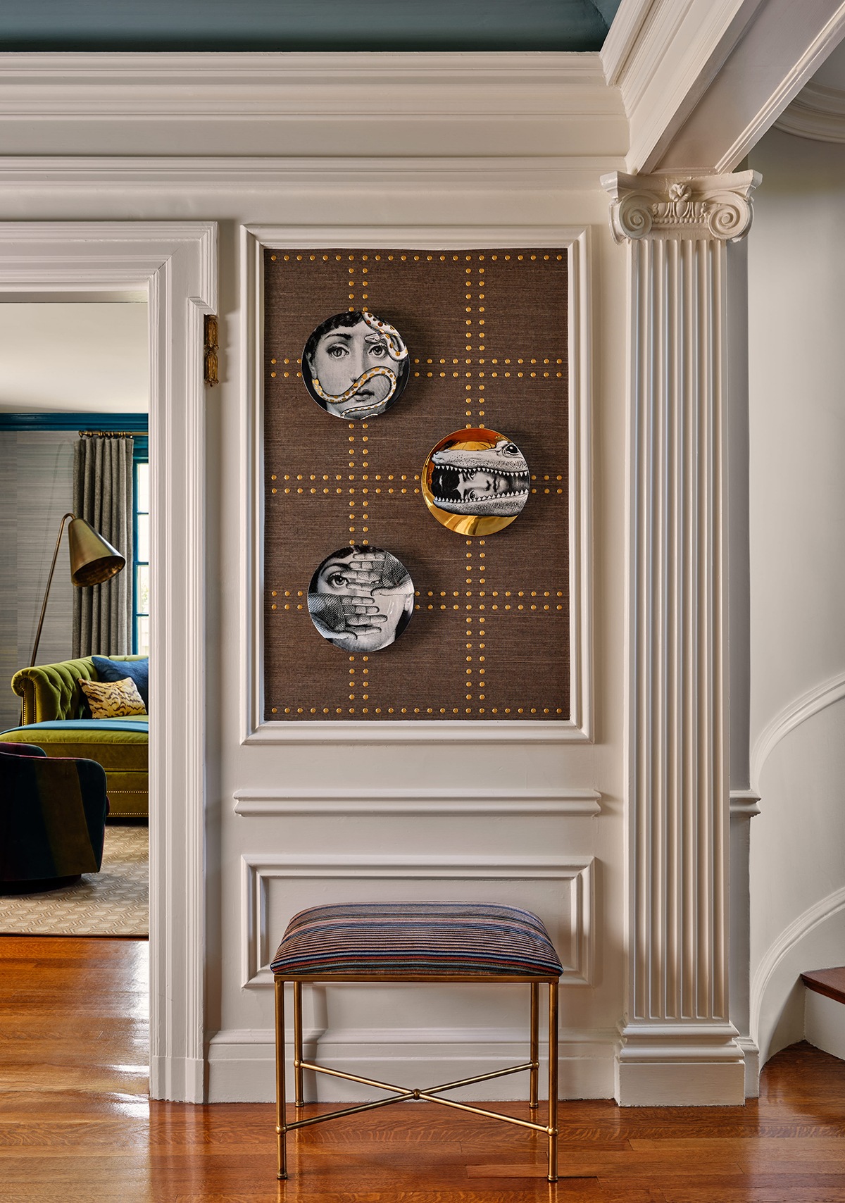
The foyer offers a neutral landing spot in the home with a Global Views center table and a stair runner inherited with the home that works with all of the colors. / Photo by Read McKendree
In playing with her swatches, she knew she wanted the living and dining rooms to speak to each other since they’re set across the hall. Here, natural, original wood paneling was rundown, so after failed attempts to save it, she modernized it with a deeper shade of greenish-blue “that’s moody, how a dining room should feel.” The foyer, which splits the two rooms, is “a palate cleanser” with a reprieve from color, save for the vintage oriental stair runner.
“The house itself served as our inspiration—it had beautiful bones and architectural details,” Reider says, adding that the previous owner, who’d lived there for more than 80 years, was an architect who paid attention to retaining the striking design details. One of the former owner’s contributions was creating an eat-in table in the kitchen, which Reider was happy to hold on to in lieu of a large island, as it holds history and creates togetherness. “It’s intimate and where we do homework, eat breakfast, and prepare our meals,” she says. The room stays cozy and light thanks to gray-blue cabinetry and a backsplash made out of crackled subway tiles, another item Reider always wanted to use.
The same goes in the primary bedroom, where deep navy blues and serene purples are accented with an antelope carpet, another beloved swatch that she’d been dying to use in her own space. The wild carpet, the artful pendant, and the crackled tile were all jumping-off points for this designer’s home. All the years of client design and over-exposure led her to finish her own puzzle, complete with pieces and details that are professional and strategic yet personal and loved. “We incorporated a number of items I’ve coveted for several years,” says Reider, “which is why I knew I wouldn’t get sick of them!”

Serene yet saturated hues make a splash in the primary bedroom with pink vintage chairs paired with a custom purple headboard and an antelope Landry & Arcari rug that Reider has coveted for years. / Photo by Read McKendree

Benjamin Moore’s “Greyhound” graces the kitchen, complemented by Reider’s favorite “Stream Crackle” subway tile. / Photo by Read McKendree

Photo by Read McKendree

Photo by Read McKendree
First published in the print edition of Boston Home’s Winter 2025 issue, with the headline, “Worth the Wait.”


