A Wellesley Cape Cod Home Transforms From Traditional to Modern
Classic fades to contemporary when a much-loved Massachusetts home is reimagined for empty nesters.

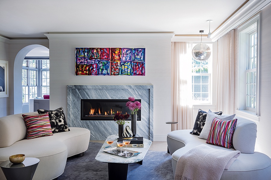
In the lounge, a vivid piece by artist Melissa Meyer hangs over the fireplace, which Elms redesigned to have a spare, linear look. An asymmetrical coffee table and rug speak to the room’s modern sensibility. / Photo by Michael J. Lee
This article is from the winter 2025 issue of Boston Home. Sign up here to receive a subscription.
Their brick Cape Cod–style home in Wellesley had been the backdrop of the family’s important moments, special occasions, and all the little things in between for decades. After becoming empty nesters, the homeowners spent a lot of time in their Seaport condominium. “But they didn’t want to let go of the house. It’s very special to them,” says interior designer Dee Elms, who had worked with the homeowners on their city home. “But they decided that it no longer worked for them the way it was, that it was time to make some changes.”
Pretty quickly, as the couple started collaborating with Elms, helm of Elms Interior Design, and Blue Hour Design architect Kyle Sheffield (who was a partner at LDa Architecture & Interiors when the project began), those small changes morphed into a big overhaul of the spacious house. “They wanted to do a lot of entertaining with their friends and have the house be a destination for their kids to come to,” says Elms, noting that they were ready to move away from the home’s traditional aesthetic toward a clean, modern vibe. The lounge, where a disco ball hangs from the ceiling, is a prime example of the home’s shift from classic to contemporary. A sleek white bar makes the room a prime spot for gathering, and two kidney-shaped Vladimir Kagan sofas face one another atop an irregular-shaped rug. The fireplace’s classic brick hearth was replaced with a polished Black Diamond stone surround, and tinted lighting inset in a cove above the crown molding was designed by Nancy Goldstein’s Light Positive. “At night, they can pick from so many colors,” Elms says. “It’s great for parties.”

A sizable sectional affords several people a place to perch during a party. The expansive new doors integrate the space with the outdoors during the warm months of the year. / Photo by Michael J. Lee

The art by Julian Stanczak picks up the dining room’s blue and pink hues. The chairs are deep-sea-blue leather. / Photo by Michael J. Lee
The new steel-and-glass wine cave in the dining room can also be illuminated with fluorescents for fun. Built in 1933, the house was broken up into small, disconnected rooms. To create cohesion, a wall between the family room and dining room was removed, and glass doors that run the length of the wall were installed overlooking the backyard. With the two rooms now combined, the radiant space is ideal for entertaining.
In the living room, an atrium captures glorious views of the property’s lush trees and greenery. “Previously, there were drapes all around the atrium, so you didn’t get the full impact of the view,” says Elms, who opted not to install window treatments there but did incorporate hot-pink drapes in an updated toile on the room’s other windows. Pops of pink throughout the room pair with the inky gray walls and sumptuous gray-and-white-toned furniture.

The living room’s white woodwork was repainted gray, and the draperies were removed from the atrium to let in as much light and views as possible. Pink-velvet cushions infuse the gray sofa with a playful pop of color. / Photo by Michael J. Lee

Drapes with a contemporary pink toile introduce more color and a bit of whimsy to the living room; the hot-pink art by Bill Thompson pops against the walls painted in Benjamin Moore’s “Temptation.” / Photo by Michael J. Lee

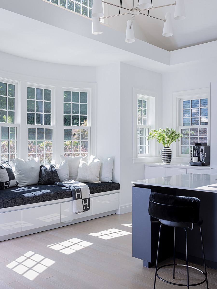
A chandelier by Jonathan Browning hangs from the kitchen’s vaulted ceiling. A banquette was enlarged to accommodate a window seat one can curl up on to appreciate the view of the backyard. / Photo by Michael J. Lee

Photo by Michael J. Lee
Dark and dated with extensive traditional trim, the kitchen kicked off the whole project. “It was in dire straits,” says Elms, recalling that “it felt very small,” which inspired the current monochromatic black-and-white color scheme. Spare, minimal cabinetry from German manufacturer SieMatic had the streamlined contemporary vibe the couple was looking for, and a mod chandelier is strung from the rectangular cove in the ceiling that Elms had altered from its previous oval shape, which felt outdated, for a more modern appeal.
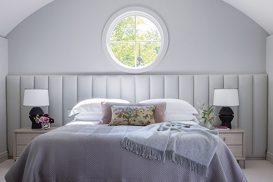
Throughout the house, heavy, traditional-style trim was removed or replaced with lean, white-painted crown molding. Simplicity was Elms’s guiding force when it came to ornamentation. In the primary bedroom, heavy window treatments came off, and wood paneling was removed from the walls in favor of a linear upholstered headboard that runs the length of the wall behind the bed, evoking a quiet elegance. “There didn’t need to be a lot of extraneous detailing, and when the paneling was removed, spaces felt much lighter and brighter,” she says.
Sheffield worked with Elms to convert the main stairway into a much more contemporary form, where steps and treads are one continuous piece and steel balusters replaced the old run-of-the-mill wood ones. Art enlivens every room, and light fixtures act as additional design elements. While it’s true that no space resembles its former incarnation, the home still holds all the family’s memories. Now beautifully refined, it’s poised to create more special moments ahead.

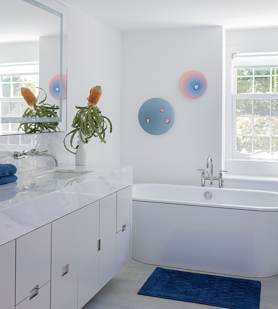
In the adjacent bathroom, the soothing scheme is punctuated with art by Jane Wilson. / Photo by Michael J. Lee

Elms designed a headboard upholstered in Holly Hunt faux leather that extends the length of the wall behind the bed in the primary bedroom. / Photo by Michael J. Lee

Photo by Michael J. Lee
SWEAT THE SMALL STUFF
“You have to think about the stuff that you want to recede really early in the design phase,” says Sheffield, noting that some aspects—including where tile, stone counters, and cabinetry come together in kitchens or where the HVAC is installed in a wine cave so it doesn’t detract from the visual impact of the Lucite racks—can become design challenges (incurring additional cost) if not considered before construction. “Fireplaces also have a lot of technical aspects involved in how to make vents disappear from view,” he continues. “So it was helpful and interesting to collaborate with Dee’s firm throughout the process. She would send us elevations and layouts, and we’d go back and make sure these types of things checked out.”
Architect
Blue Hour Design
Builder
Benchmark Builders
Interior Designer
Elms Interior Design

The foyer’s moody wallcovering is by Phillip Jeffries; art above the console is by Warren Isensee. / Photo by Michael J. Lee
First published in the print edition of Boston Home’s Winter 2024 issue, with the headline, “What Comes Next.”


