Stephanie Terfloth Wagner Designs For Timeless Harmony
Standout textiles inform schemes that balance old and new for a color-loving couple in the South End.
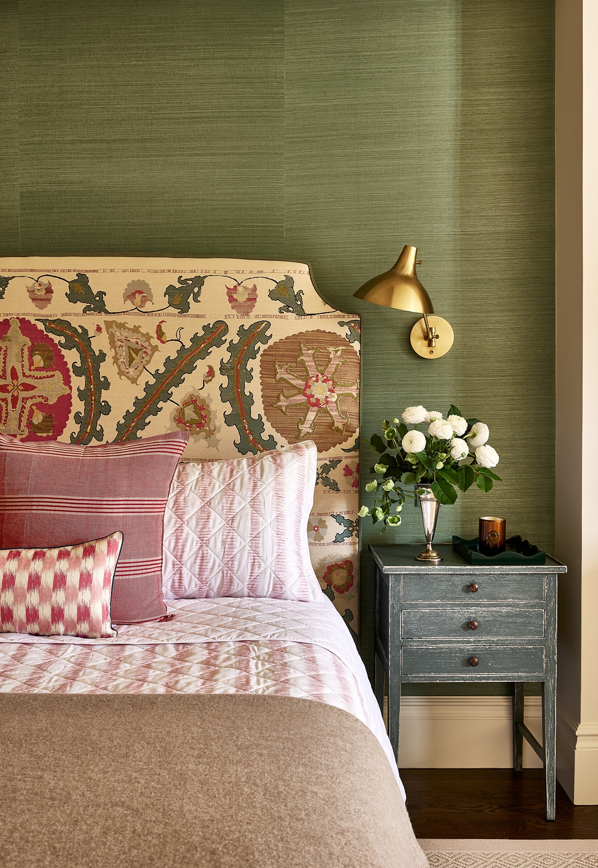
An earthy take on pink and green was used in the primary bedroom of this South End townhouse designed by Stephanie Terfloth Wagner. Grasscloth wallcovering and distressed nightstands add extra texture to the multilayered room. / Photo by Matt Kisiday
This article is from the spring 2025 issue of Boston Home. Sign up here to receive a subscription.
Stephanie Terfloth Wagner’s clients feel deeply about making their homes beautiful. The challenge? One has contemporary tastes, and one grew up antiquing. They tasked Wagner, who founded Salt Point Studio after relocating to Boston from San Francisco, with merging their aesthetics. “If I learned anything from Ken Fulk, it was how to put old and new together,” Wagner says, referencing her former employer.
As first-time homeowners, the couple furnished the 1860s single-family townhouse that they share with their two young children from scratch. Color and pattern were the jumping-off points. “We built off a great hero fabric for each room,” Wagner shares. In the living room, it was the cascading blue floral drapery fabric by Soane, which has a range of blue tones that Wagner pulled through the home. From there came the durable navy wool sofa upholstery. “The absence of piping makes the traditional sofa with casters feel updated,” Wagner says.
The modern, undulating glass coffee table’s transparency lets it disappear, so the eye is drawn to the early 1800s French chest with marquetry and ormolu. “It brings in a layer of warmth you can’t get from pieces today,” Wagner remarks. The burnt-orange ticking-stripe fabric by Penny Morrison on the armchair introduces another color while the custom rug is airy without skewing too contemporary. “Rugs were tough,” the designer says. “One wanted Orientals and one geometrics.”
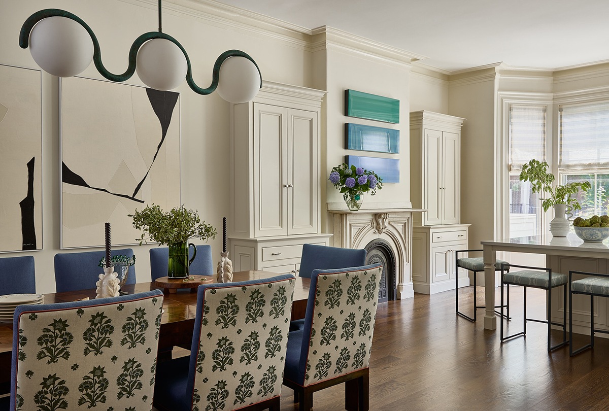
Working with Wagner’s color scheme, the homeowners chose a series of three mixed-media panels by Los Angeles–based artist Andrzej M. Karwacki from Jules Place in SoWa to hang above the mantel between the dining area and kitchen. / Photo by Matt Kisiday
A vintage Paul Evans Patchwork burl-wood dining table holds the center of the space. Vintage chairs with clean lines, brass bases, and backs boasting a symmetrical Soane floral fabric framed in orange piping tie this space to the living room surrounding it. Above, an Astraeus Clarke chandelier with an art nouveau vibe adds a funky flair. “The verdigris finish has a tonal variation that brings in green without being as match-y as a painted finish,” Wagner points out.
While the parlor level is where daily life unfolds, the library is an adult escape. The room is drenched in a smoky navy, enlivened by red-and-blue floral drapery fabric by Oscar de la Renta. Rusty stripes re-appear; ticking on vintage armchairs with carved hoof legs, and thicker stripes on a curvy bench that provides seating without overstuffing the space. A red-lacquered peekaboo bar is the party trick. “The design lends the sense of being transported in your own home,” Wagner explains.
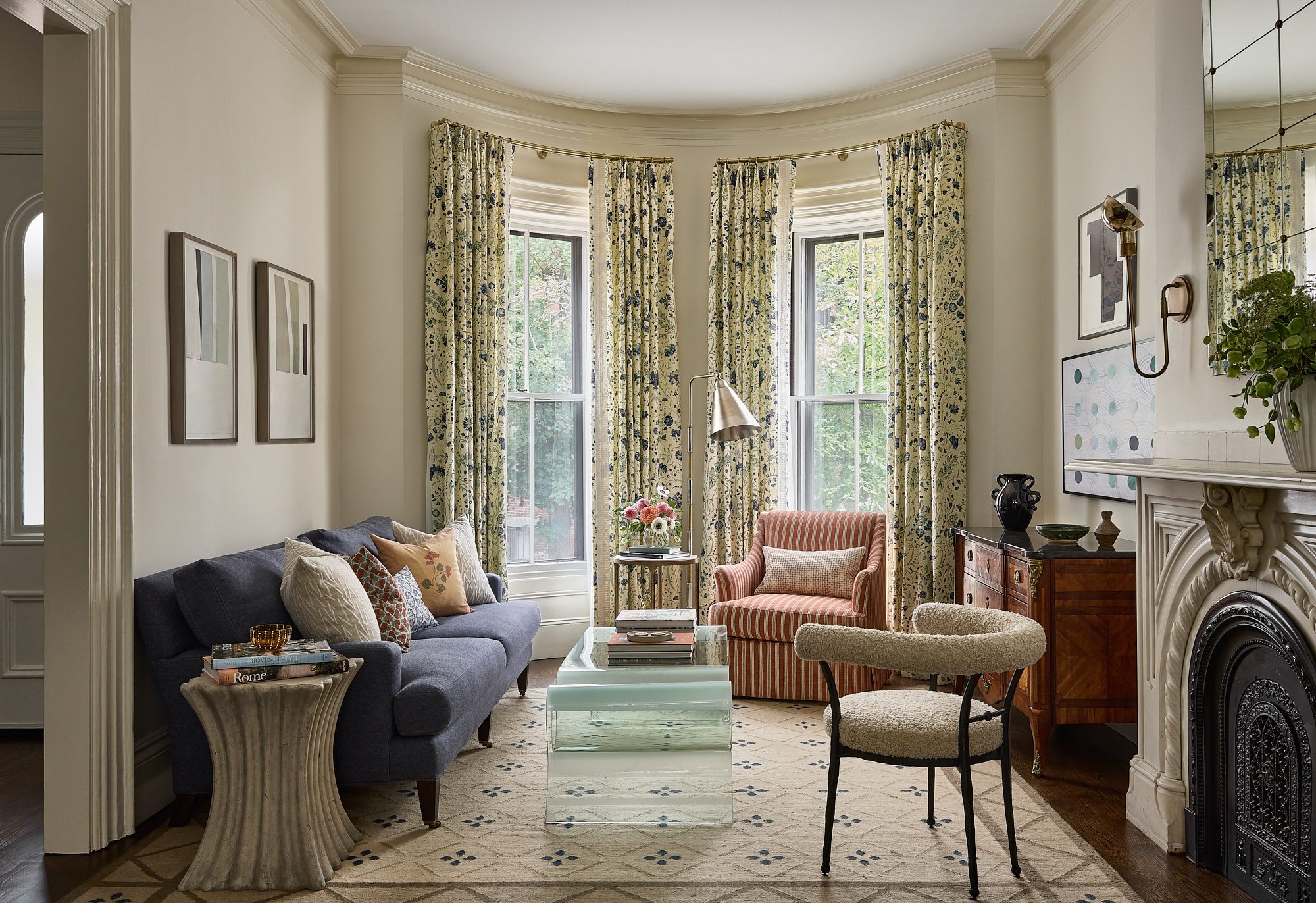
Wagner tweaked the layout on the parlor level slightly, extending the wall between the entry and living room to accommodate a full-size sofa. The walls are painted in Benjamin Moore’s “Timid White.” “It’s a warm, creamy backdrop for the textiles,” the designer says. / Photo by Matt Kisiday
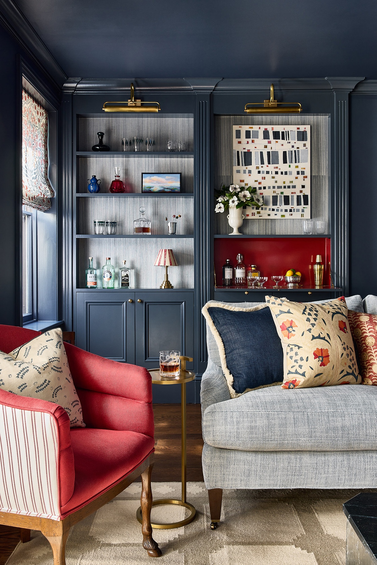
In the library, painted in Benjamin Moore’s “Evening Dove,” artwork by Beth Munro from Willard Gallery in Portland, Maine, helps draw the eye to the drop-down bar, painted in Benjamin Moore’s “Caliente.” “The piece pulls you in and is also fun to look at up close when mixing a drink,” Wagner says. / Photo by Matt Kisiday
The designer leaned into green with rosy accents in the primary bedroom. The scheme plays off the Robert Kime linen with a global sensibility that re-covered the couple’s bed and pops against the sage-green grasscloth wallcovering. “I typically don’t do accent walls, but it makes sense here to anchor the bed to the existing architecture,” Wagner says. The texture continues in the dressing room down the hall, which is lined with grasscloth and silvery sage millwork under the eaves. In the nursery, they had fun with pink, devising a sweeter (but not cutesy) version of the parents’ palette.
The couple loves how the design combines their tastes at every turn. Wagner credits the success to their mutual love for color and pattern. “I definitely don’t do gray boxes,” she says. Indeed.
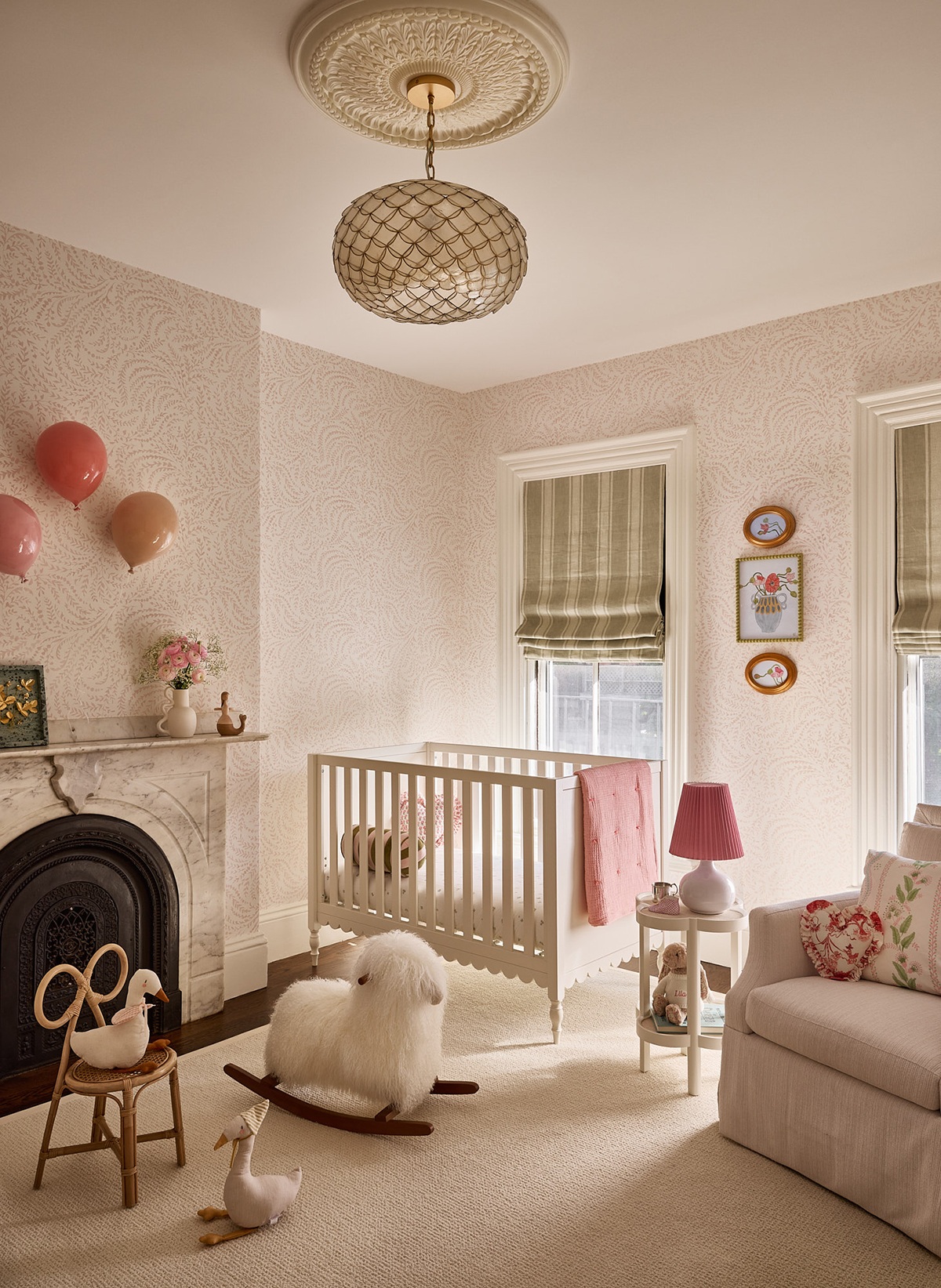
In the nursery, ceramic balloons by Sivan Sternbach float up the wall atop Serena & Lily wallpaper. “They add dimension and solid color without being framed pieces of art,” Wagner says. Striped shades in sage green mellow the proliferation of pink. / Photo by Matt Kisiday
Builder Benjamin Construction
Interior Designer Salt Point Studio
Photo Stylist Kerryn Connolly
First published in the print edition of Boston Home’s Spring 2025 issue, with the headline, “Mixing it Up.”